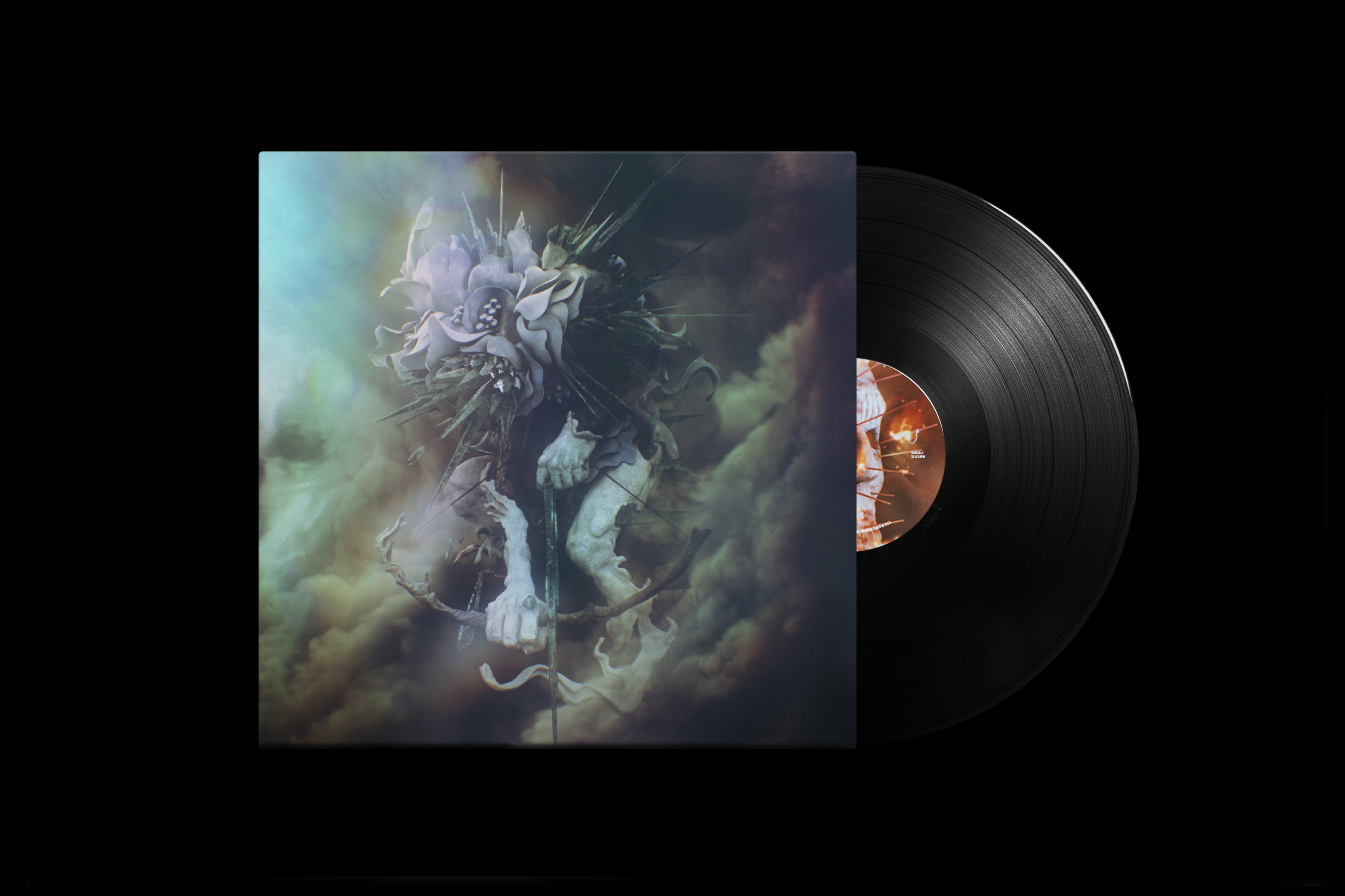
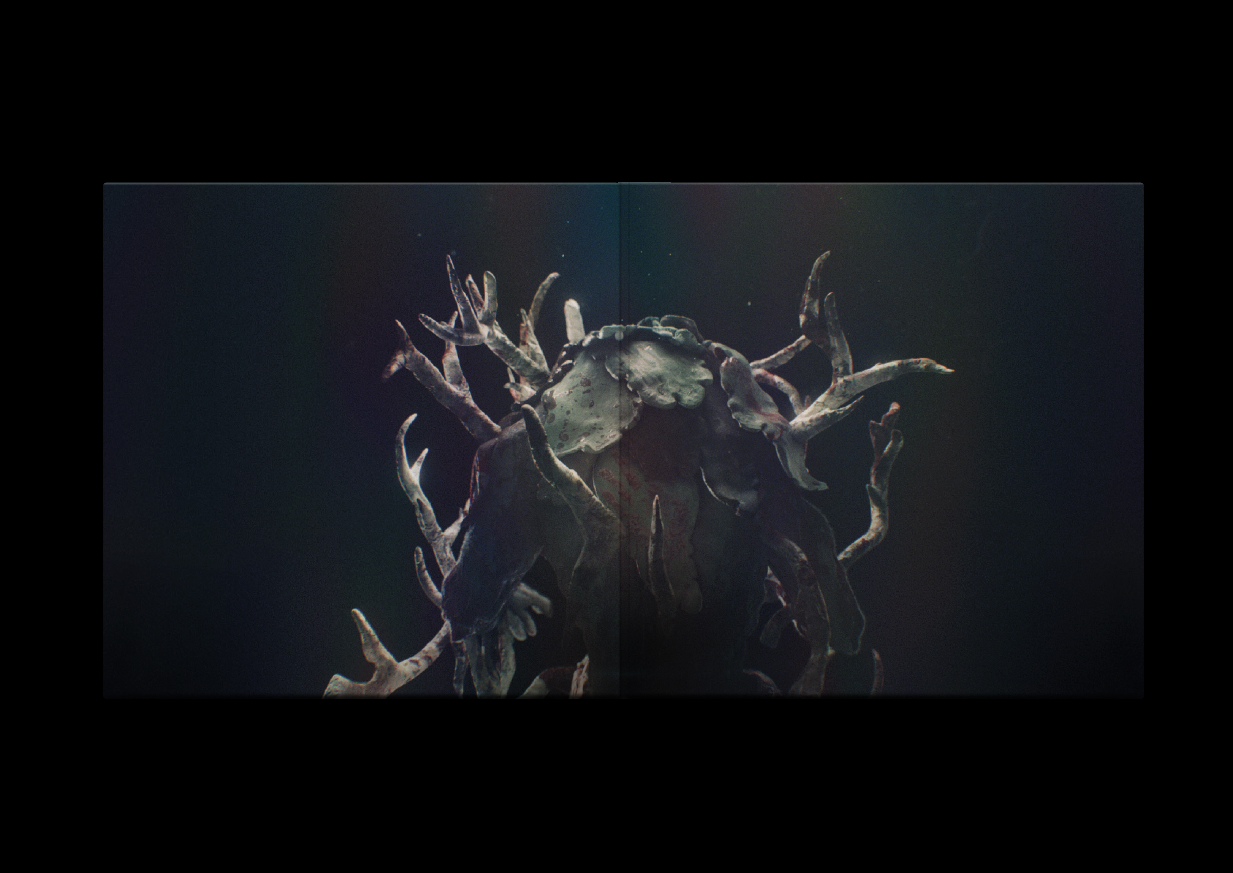

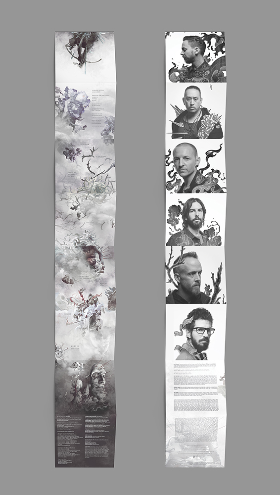
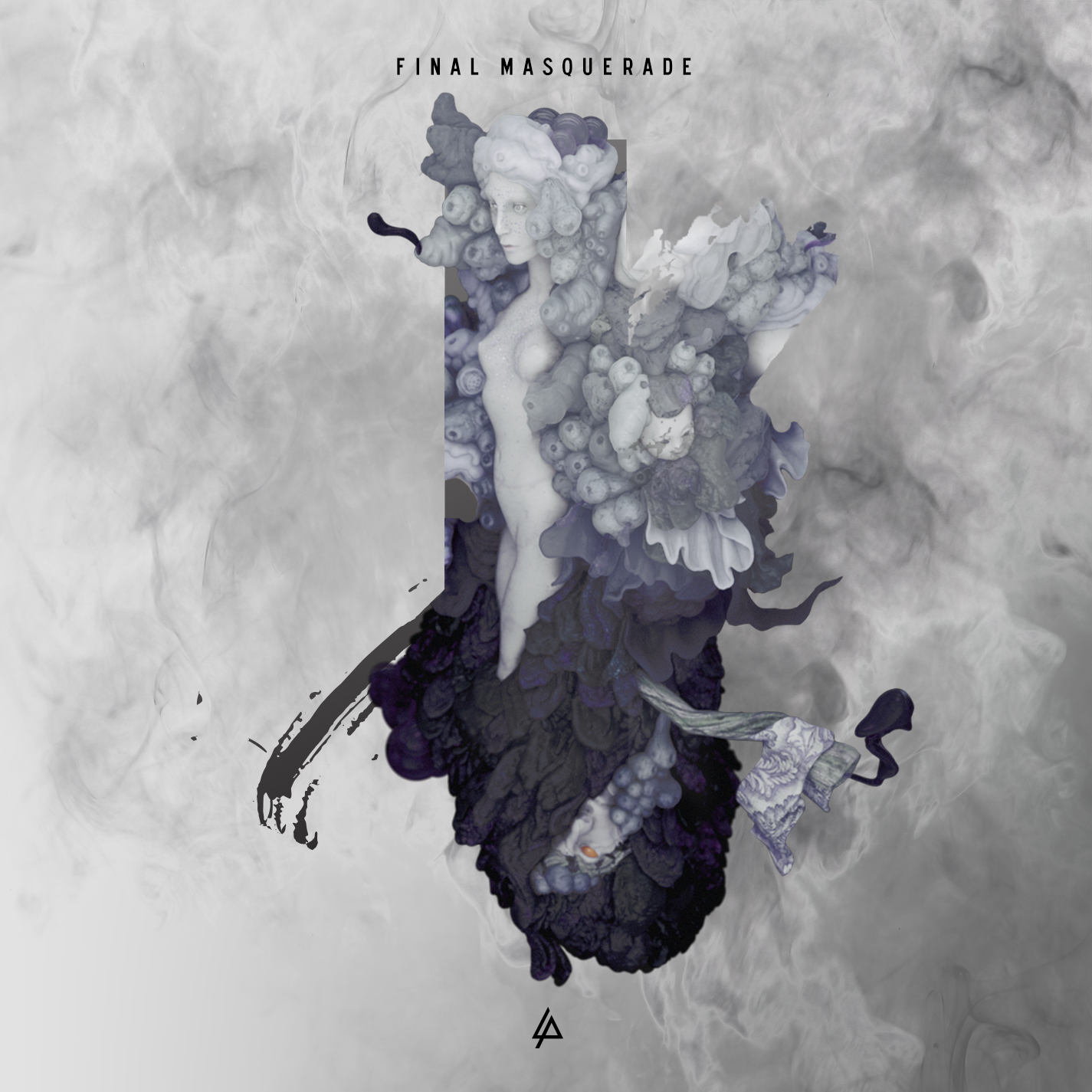
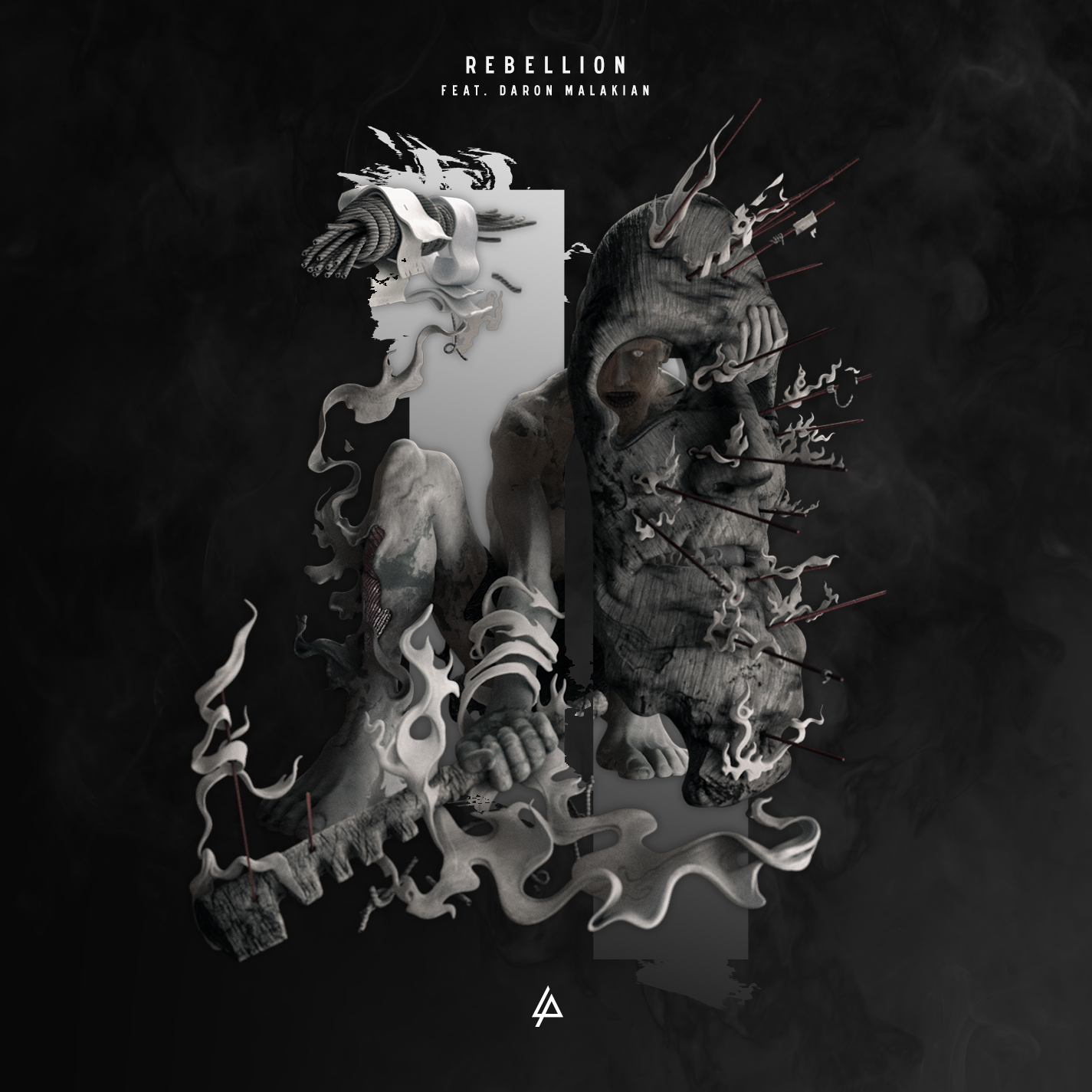
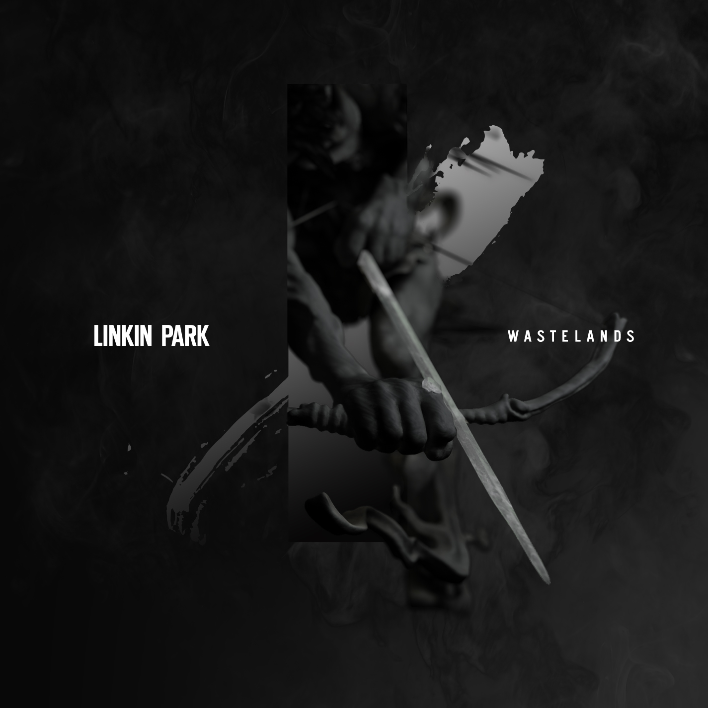
The Hunting Party (2014)
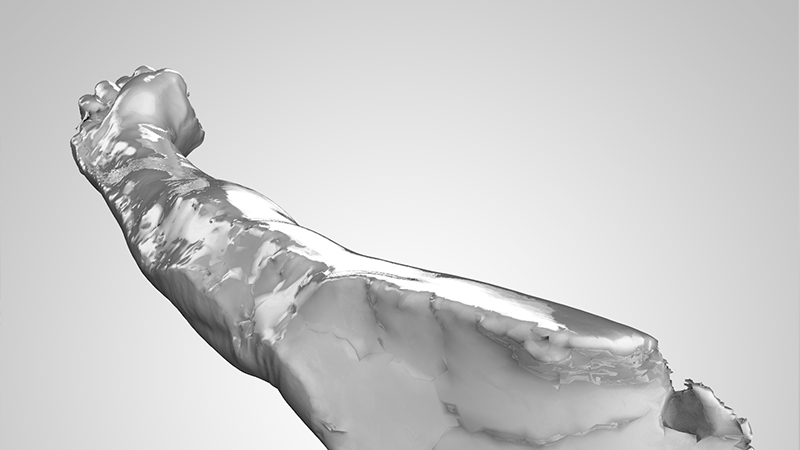
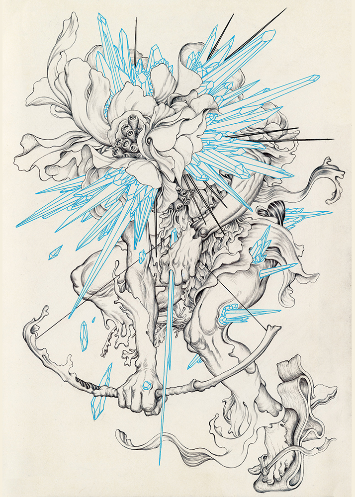
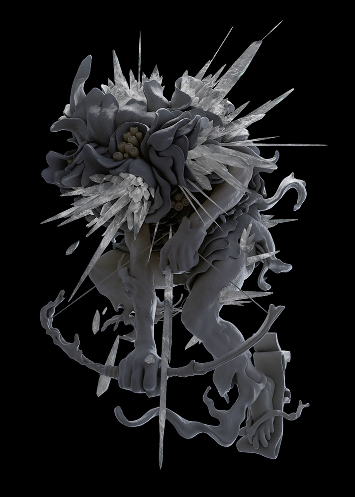
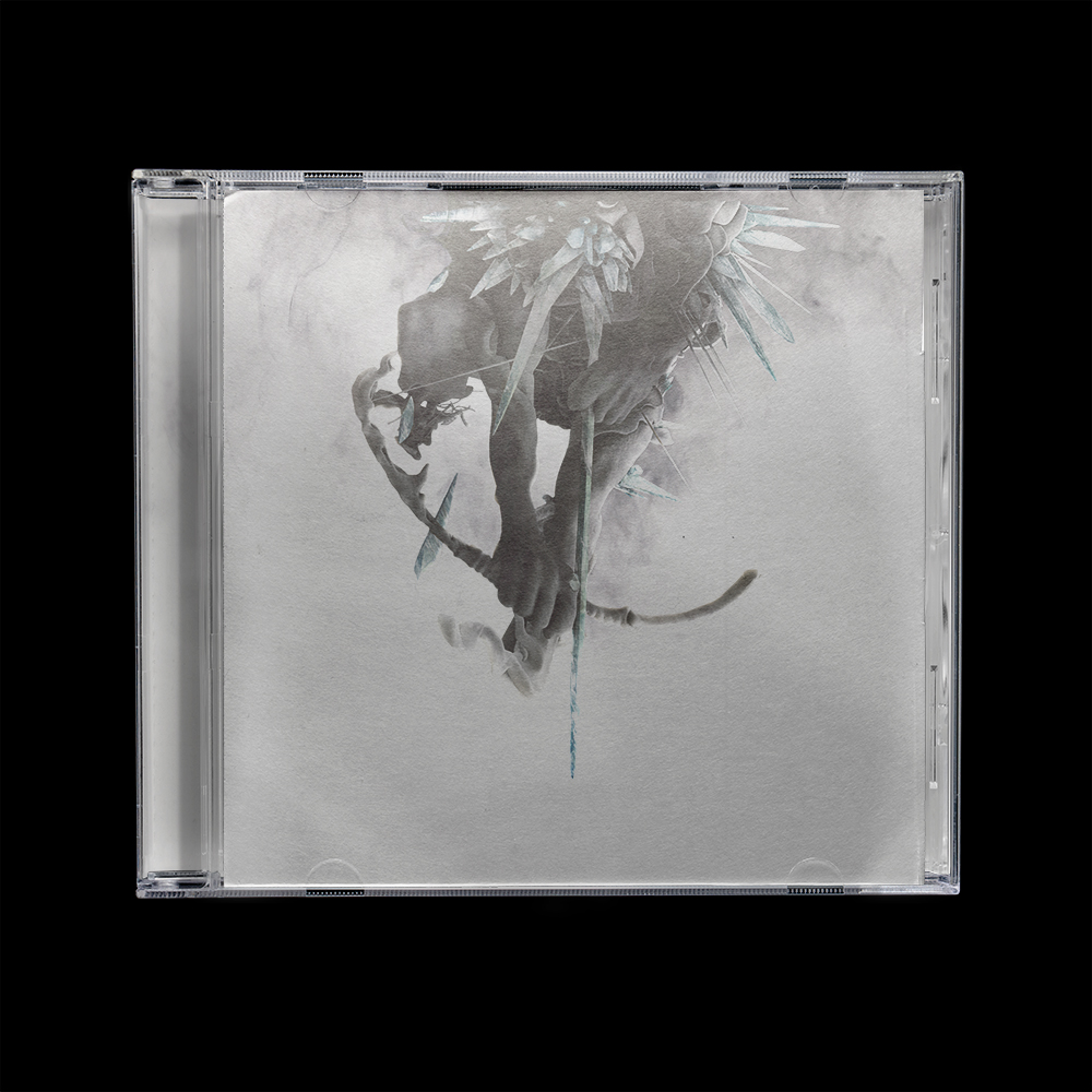
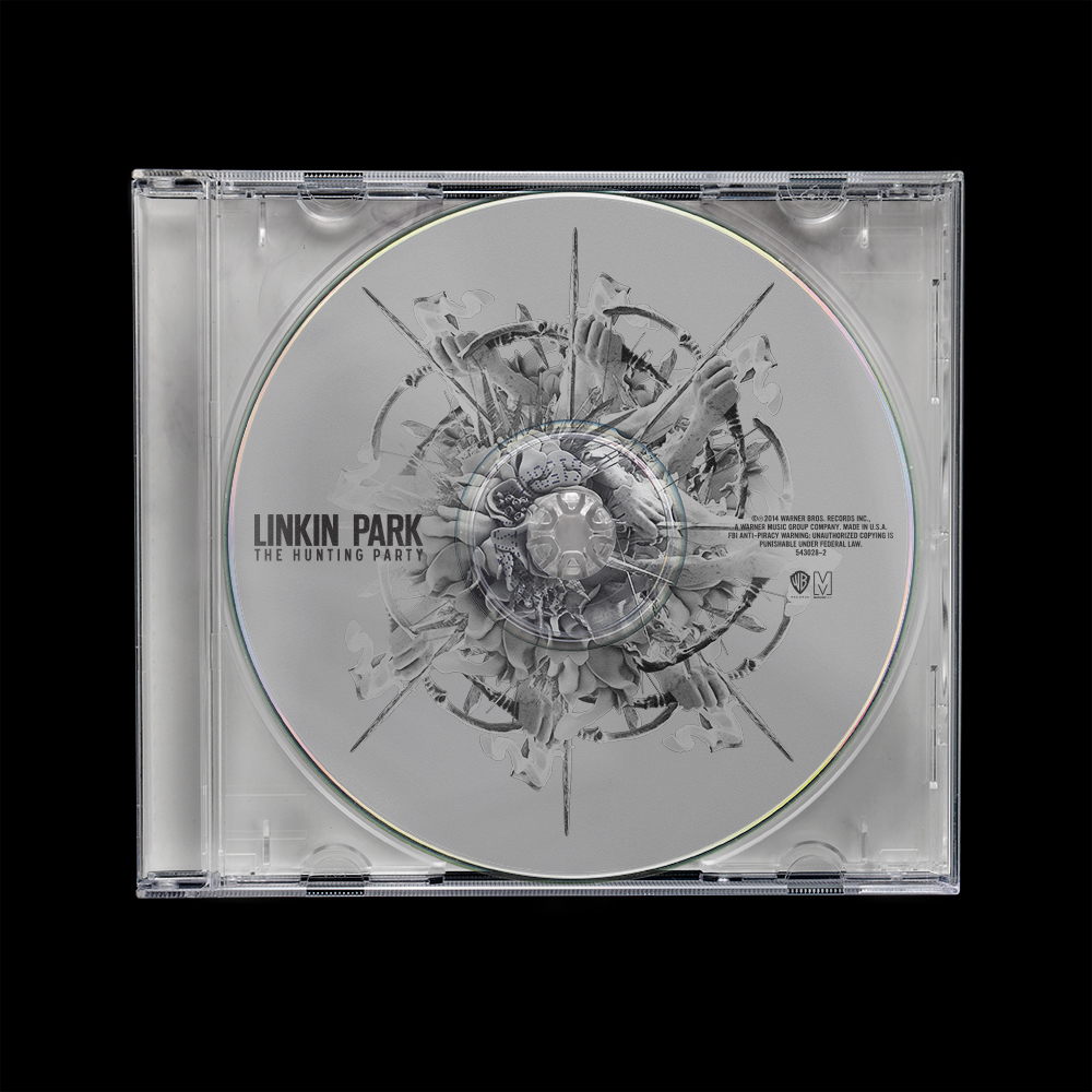
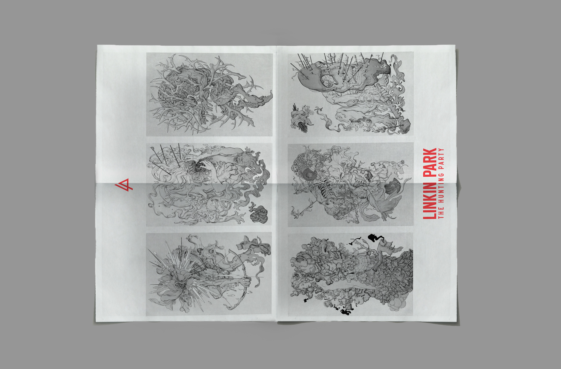
The Hunting Party needed more than album art. It needed a world. The concept behind the design is that the characters exist in a constant loop, a universe of perpetual motion and chaos. The packaging is designed in a vertical format so that as the user unfolds it, their eye follows the archer's arrow downward, falling into the same world The Archer is about to enter. Text, characters, and composition all descend together. The back of the fold out is where you finally meet The Hunting Party.
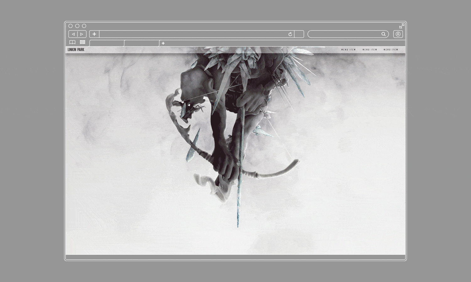
That same vertical logic extended to the website — I developed a wireframe and design that gave users the experience of falling through the same fold, mirroring the physical album artwork in a digital environment.
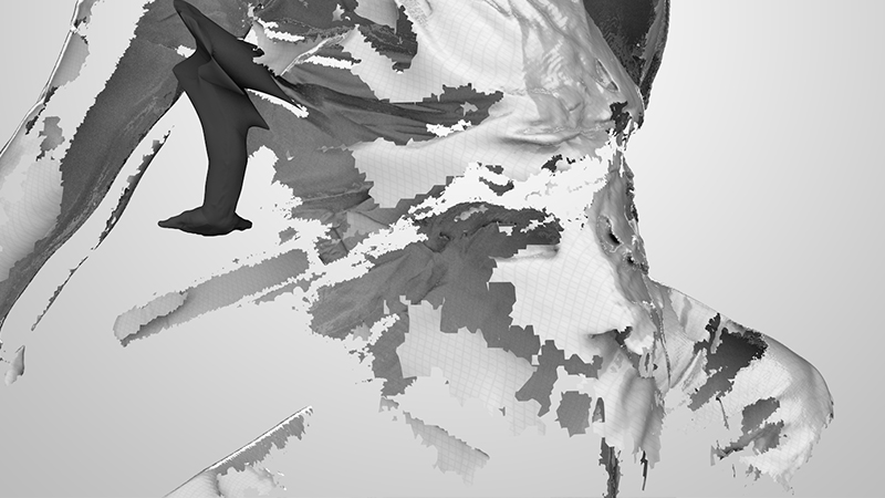
I also developed over 200 original marks using a combination of brush, ink, scanner distortion, and digital processing. Many of these marks went on to be used in stage visuals by Ghost Town.
All art direction, design concept and design, packaging, and print by Annie Nguyen.
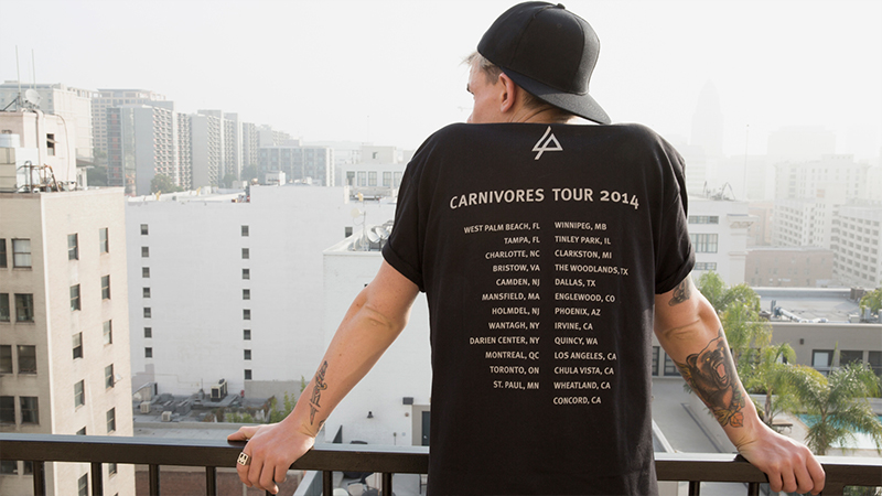
included with all merchandise purchase at shows.


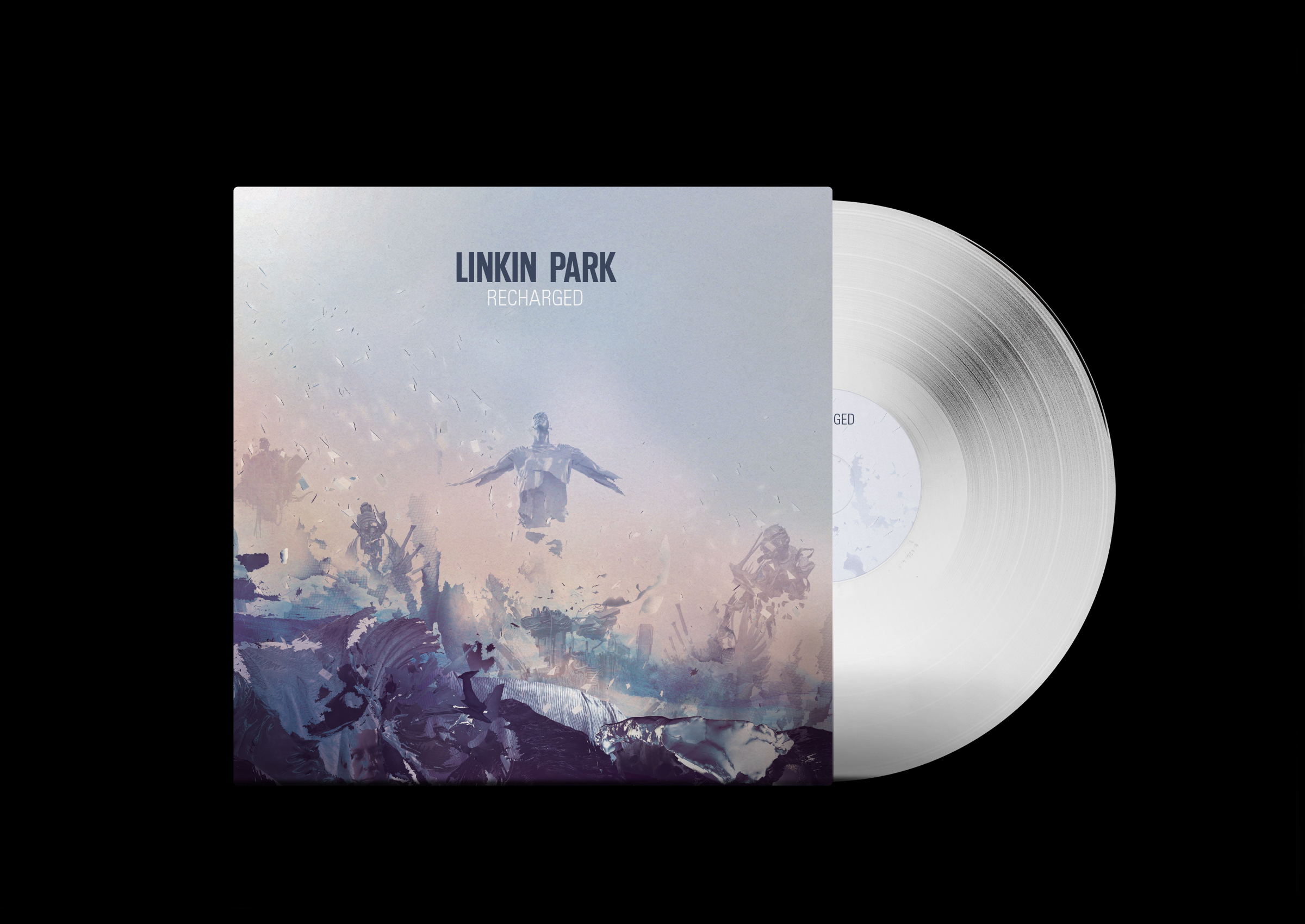
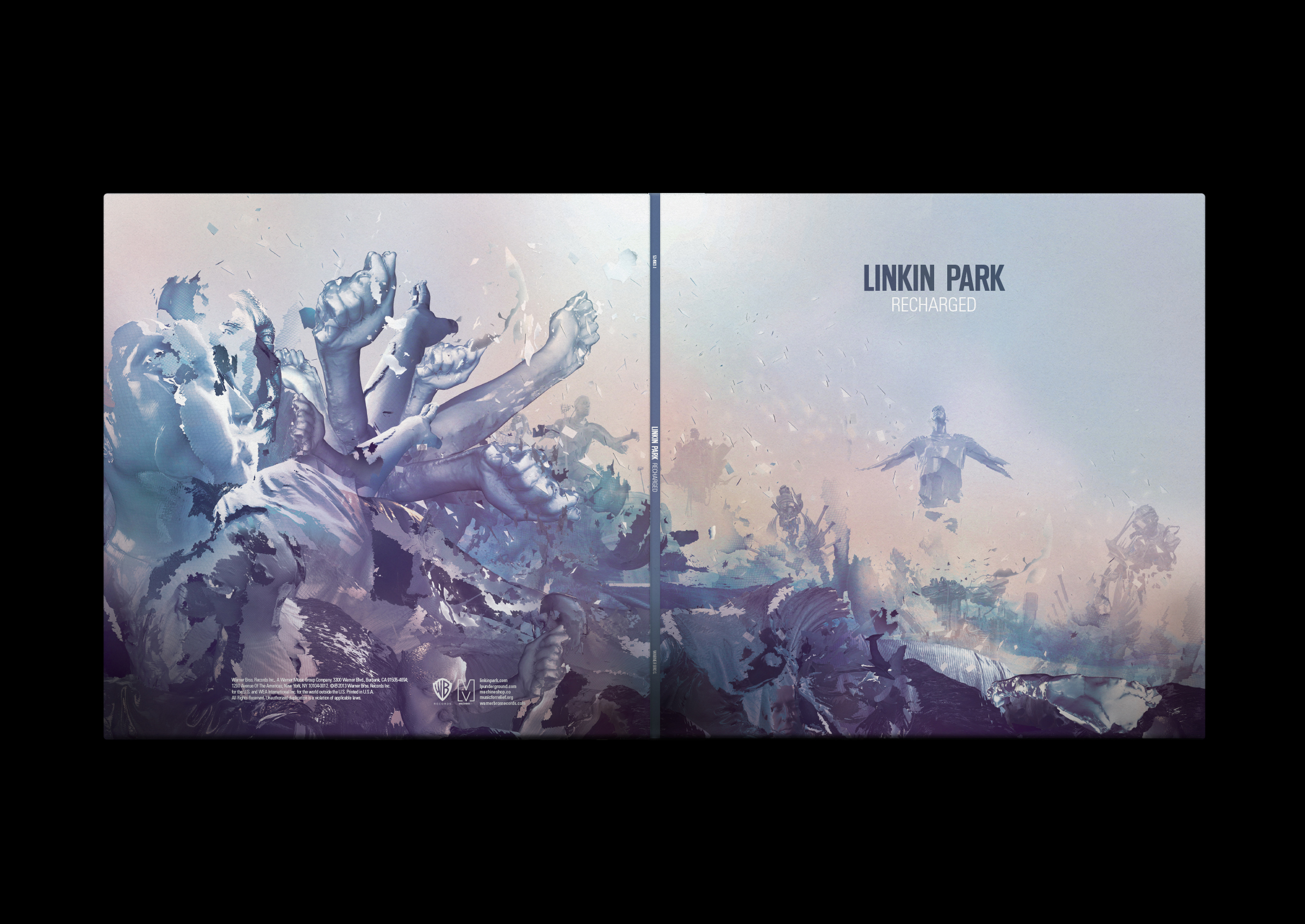
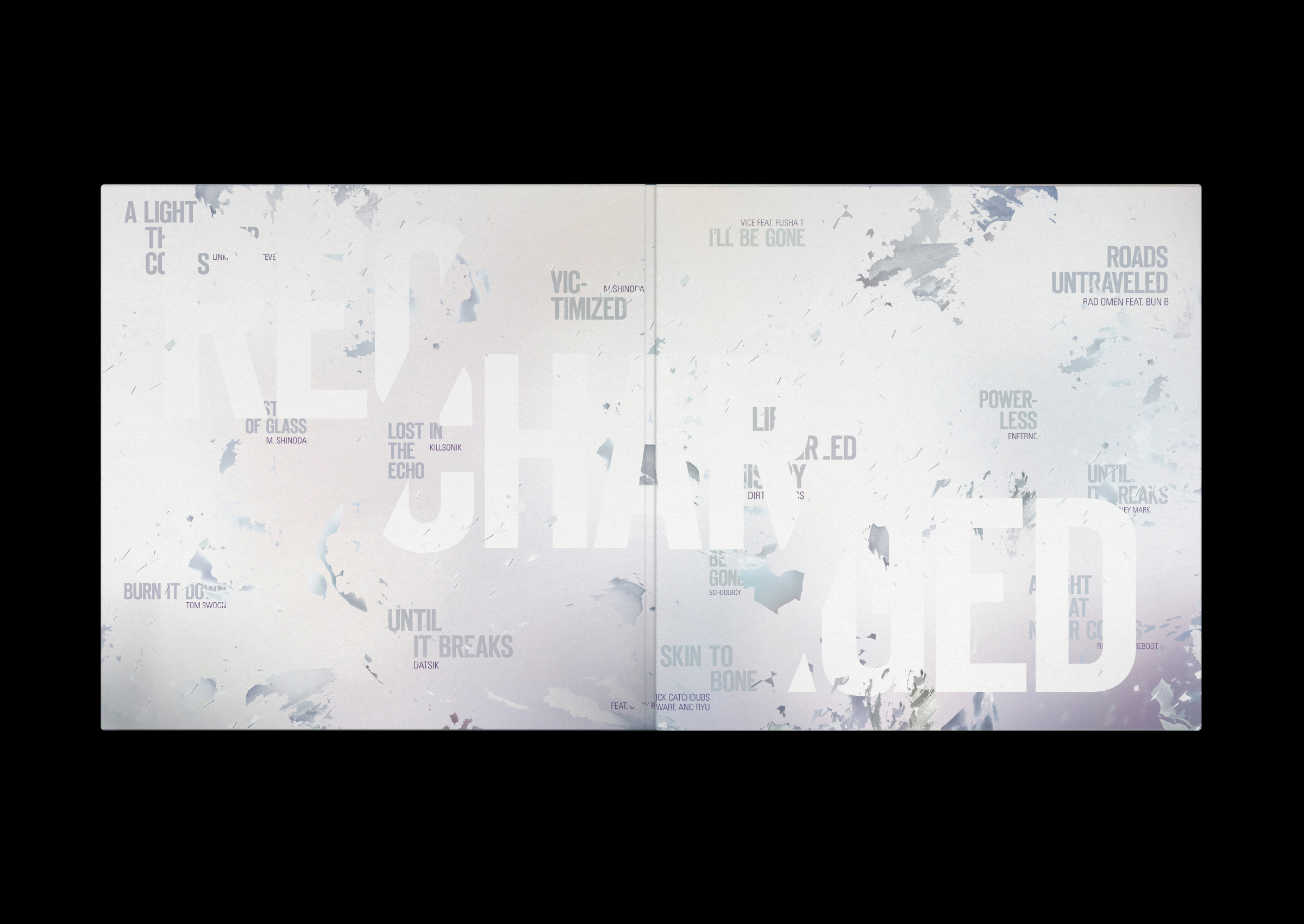
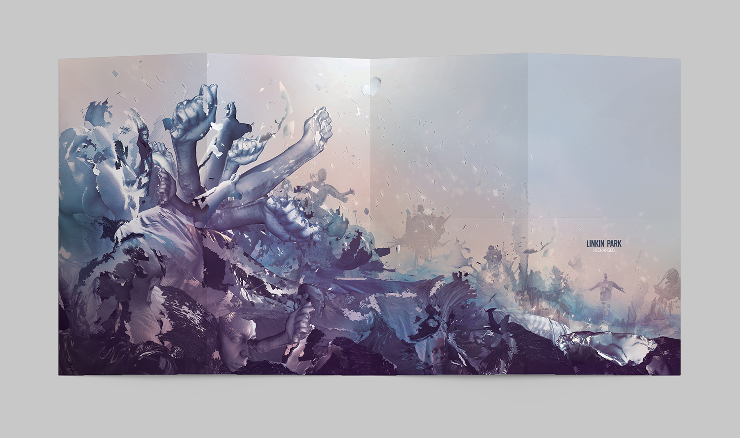
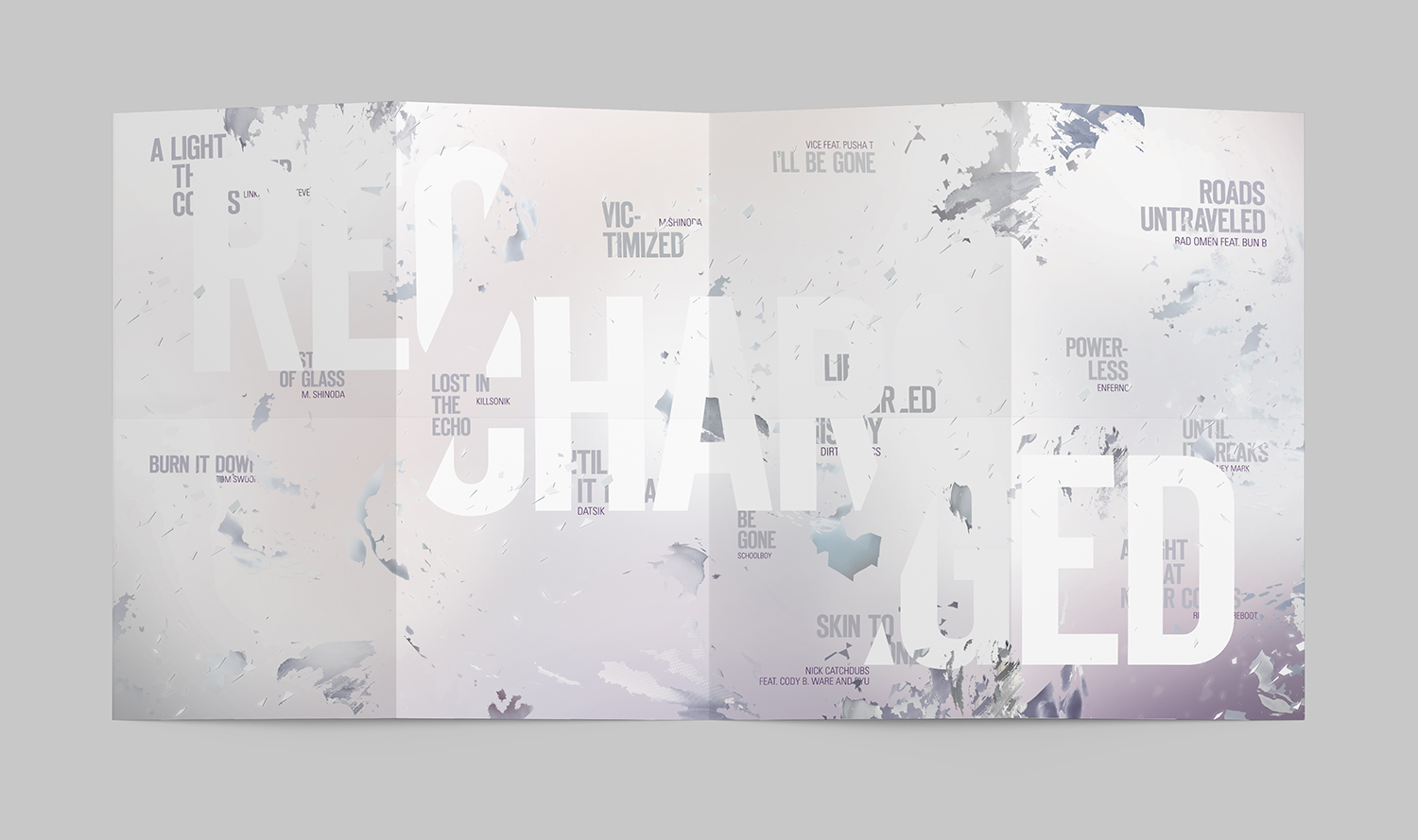
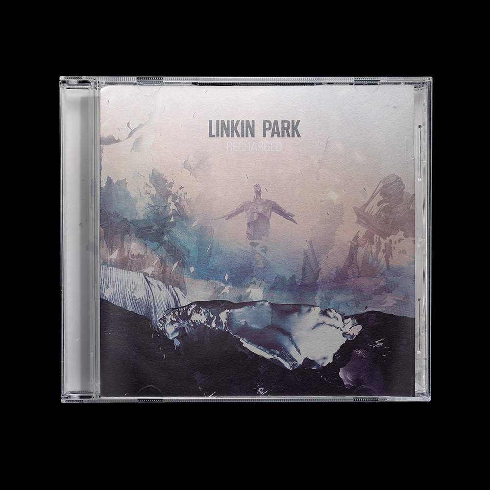
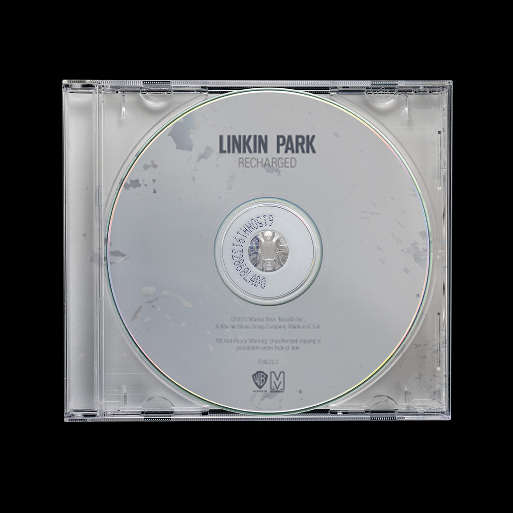
Recharged (2013)
Recharged is high octane, aggressive, technological. The album packaging had to match that energy.
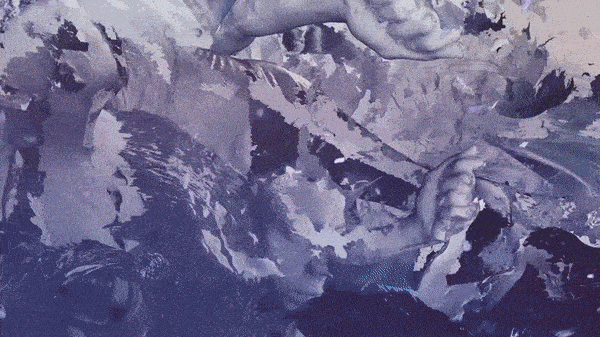
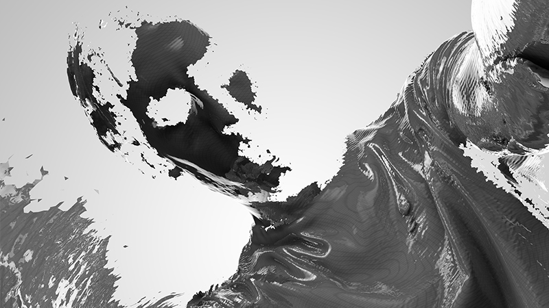
The concept takes the album's mood literally — an explosion of body parts and buildings suspended in a surreal science fiction world. Inside, the same energy continues through typography alone, letting the language carry the intensity of the imagery. All collateral during the Recharged era was designed to match the album artwork, extending the visual world consistently across every touchpoint.
Art direction, design concept, design, and print production by Annie Nguyen. Creative oversight by Mike Shinoda.
See select screenshots.↘